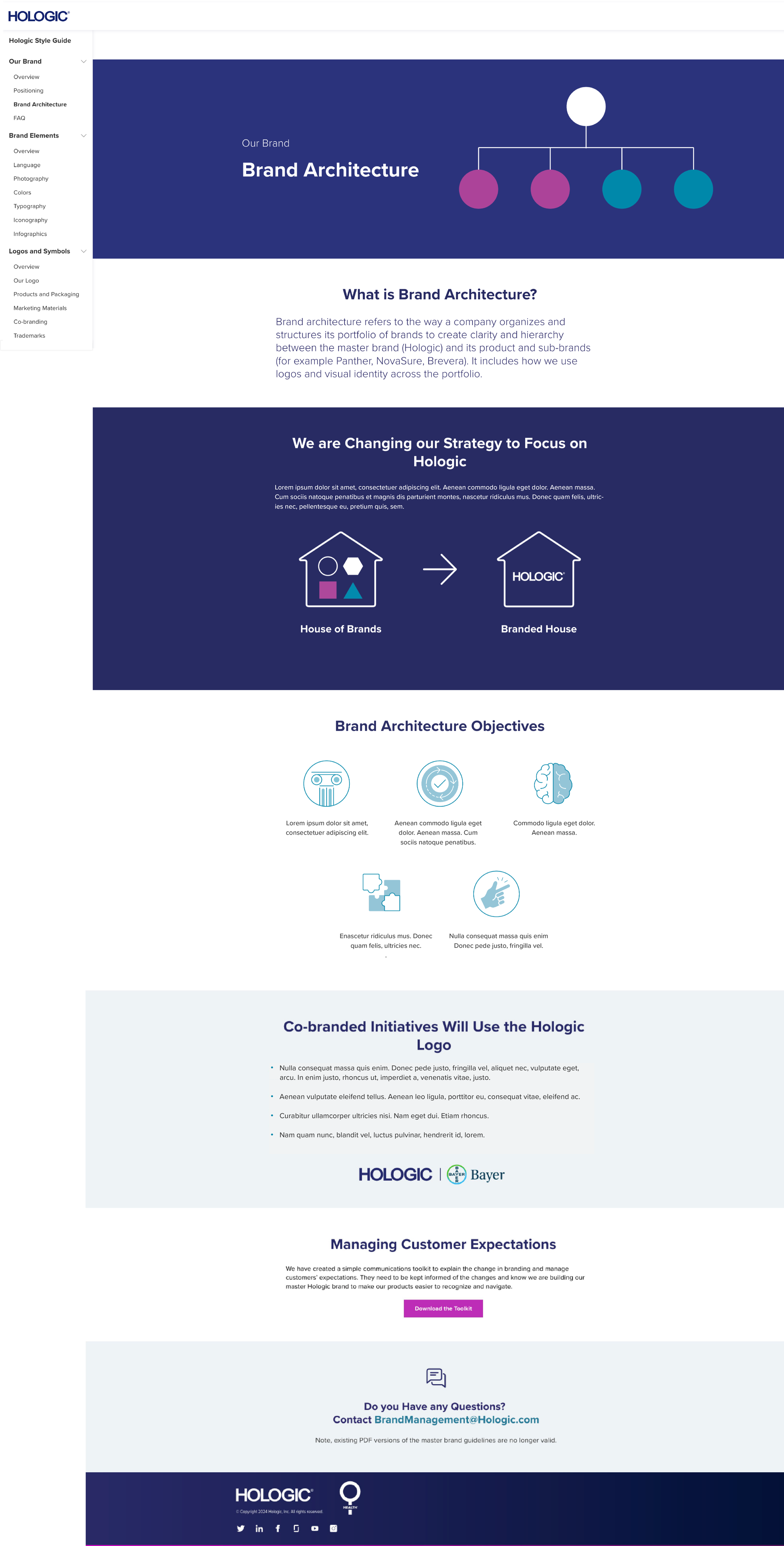
Years of growth and acquisitions left Hologic managing dozens of distinct brands—creating fragmentation, inconsistent brand expression, and operational inefficiencies.
Following in-depth market share research, the company shifted from a house of brands to a branded house, unifying under the Hologic name. The online style guide became a critical tool in operationalizing this transition across teams and channels.
My Role
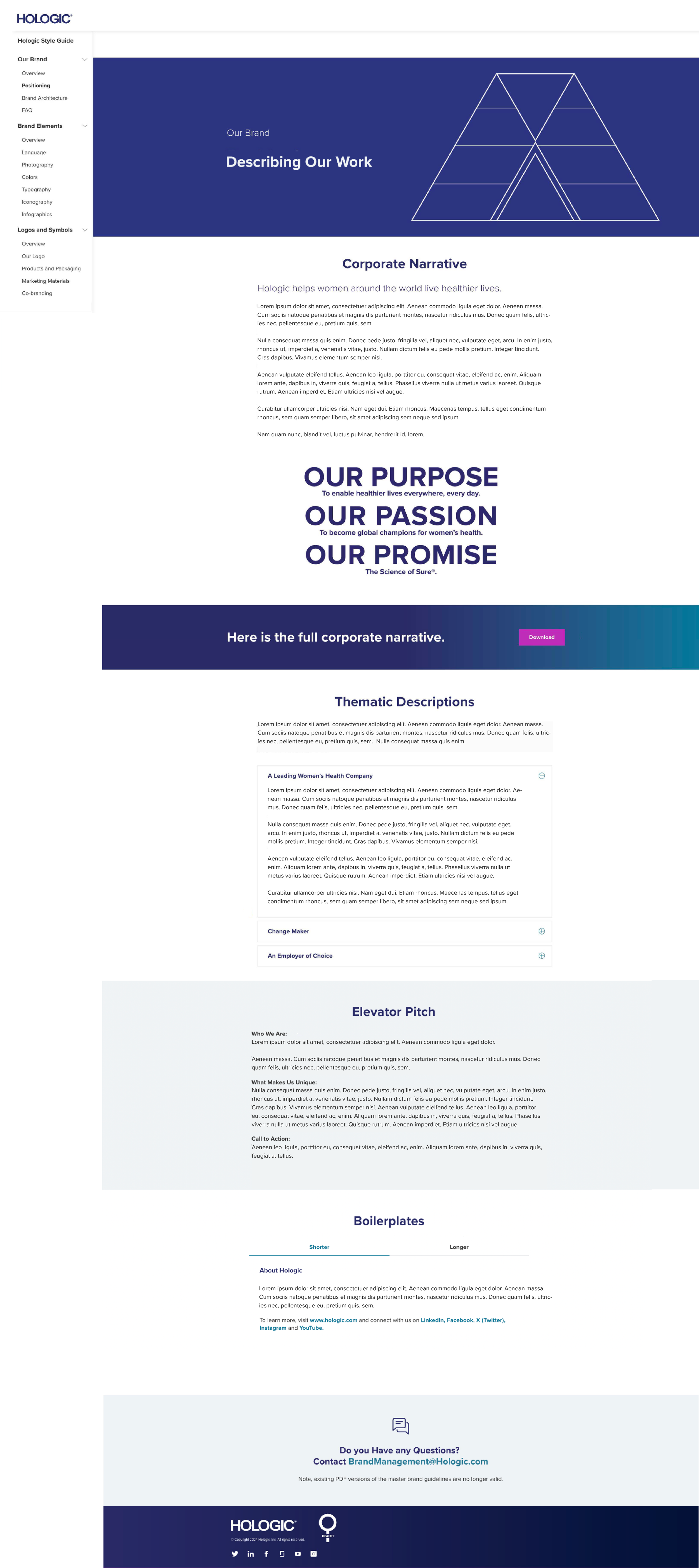
Led the development of Hologic’s online style guide, defining brand architecture, messaging frameworks, and visual standards.
Directed the design of a scalable, user-centered experience that made complex brand standards clear and adaptable as the organization evolved.
Translated brand strategy into actionable tools and guidance, enabling consistent execution across teams and channels.
Impact
Hologic operates across three divisions serving two distinct audiences — clinical decision-makers and patients — in markets worldwide. With 6,000 employees and brand standards that had to hold across every division, every agency partner, and every market, the guide wasn't a reference document; it was operational infrastructure.
Adoption was enterprise-wide. Teams and vendors could independently answer questions around messaging, logo use, and photography — without routing every decision back to the core brand team. The expandable architecture kept the guide current through ongoing regulatory and brand standard changes without requiring a rebuild, protecting both compliance and consistency over time.
I led the creative direction of a system of illustrations and hero styling to make complex brand standards intuitive and engaging. I also established a scalable, nested navigation structure to support ongoing growth and evolution. The result was a dynamic, user-centered tool that codified the brand and enabled consistent adoption across teams.